
For my final major project (FMP) at university, I conceptualised and designed the advertising / branding for a hypothetical horror movie festival in the north-east of England titled UNCANNY. I designed a main advertising poster featuring a minimal colour palette and a very graphic design heavy illustrative style, ten different illustrated horror movie posters (that were then physically printed using a risograph printer) and an editorial advert that focused on the simplicity of effective graphic design and a typography focus.
(All of my designs are conceptual for a proposed fake festival.)
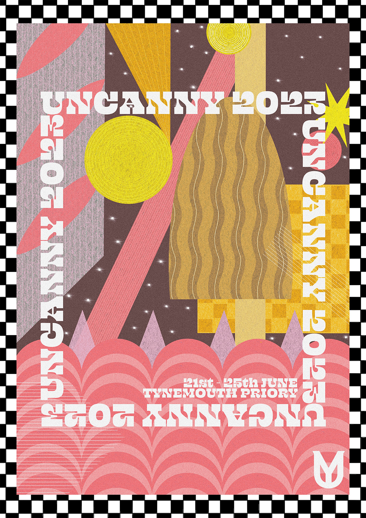
For my advertising poster, I gained a lot of inspiration from a wide range of sources, but particularly the new-age graphic design style that focuses on geometric shapes and a minimal colour palette for an eye-catching design. The shapes I used within the design are to reflect the proposed venue of the festival (for example, the pink pattern at the bottom of the poster reflects the coastline where the venue sits). I also utilised a consistent typographic style throughout all of my FMP outcomes, as well as a hand-rendered logo - I explored a lot of effective brand identity within this project, which resulted in a professional outcome.


Throughout my ten illustrated horror movie posters, I explored a minimal colour palette so that they could be printed using a risograph printer - I limited myself to three colours per illustration, including yellow, red, blue, pink, green and black. I achieved a range of different tones and shades by layering the different colours together, which allowed for a wider range of more realistic / representative colours. I used consistent backgrounds and typography throughout, as well as including my logo in the bottom right corner. I also utilised a different typeface for the main title of each of the movies, so that they all had a unique and personalised typographic element to each design, which reflected the tone of each movie more effectively. My personal favourite poster designs are for 'Get Out' and 'Parasite' due to the use of linework and backgrounds to draw your focus to the main illustration.

With my editorial advert outcome, I utilised an image of the venue (Tynemouth Priory) and applied a range of colour filters on Adobe Photoshop to achieve a more eerie tone of voice - I also added a Noise filter to give it a more gritty and punk type feel. I also added a tagline to the top of the advert to draw your attention, and added some information about pricing and where to find further information. The final outcome is effective and really reflects the indie movie festival vibe I was hoping to achieve.


